
2023
Fencing Federation of Russia
The FFR website is currently recognized as one of the best among sports organization websites in Russia. Therefore, it must reflect this status not only in substance, but also in aesthetics.
Website
Sports
About
A Two-Stage Redesign Unifying Press and Sports Data While Elevating the Federation’s Digital Identity and Visual Impact
The Fencing Federation of Russia is one of the country’s most accomplished sports organizations. This case represents a strategic redesign carried out in two phases. The first stage focused on merging the platform’s dual purpose: unifying the press service’s editorial content (news, events, updates) with the official reporting system containing competition data and rankings. The second stage aimed to create a distinct and modern design language that balanced visual freshness with a timeless aesthetic — highlighting the prestige and legacy of the sport while making the site more engaging and accessible for a broad audience.

Problem
By rethinking structure and design, we helped a leading sports federation unify its digital presence and elevate its online identity.
The Fencing Federation of Russia is one of the nation’s most successful sports organizations — yet their digital presence didn’t reflect this legacy. For years, the platform was split into two disjointed areas: a press-driven news section and a technical competition database. This fragmentation created a confusing experience for users and diluted the brand’s impact.
On top of that, the visual design lacked cohesion, modernity, and emotional resonance. It didn’t match the federation’s status or the prestige of the sport. Our challenge was twofold: first, to merge the two platforms into a seamless, user-friendly experience; second, to develop a bold, elegant visual identity that could feel both current and timeless — celebrating tradition while supporting long-term digital growth.

Solution
By combining minimal aesthetics with strategic research, we delivered a bold yet timeless platform for the Russian Fencing Federation.
Our mission was to rethink the Federation’s digital presence and create a unified platform that connects two key areas: media and press coverage, and official competition results. Working in a tight duo, we started with an in-depth market benchmark of leading sports federation websites to identify patterns, gaps, and opportunities. That research shaped our design direction.
We developed a clean, modern visual identity rooted in minimalism — a style that reflects the precision and clarity of the sport itself. This approach allowed us to maintain a strong, recognizable presence while keeping the focus on the core content. The result is a fast, intuitive, and visually confident website that balances editorial depth with functional clarity — and stands out confidently in the crowded space of sports platforms.

Design
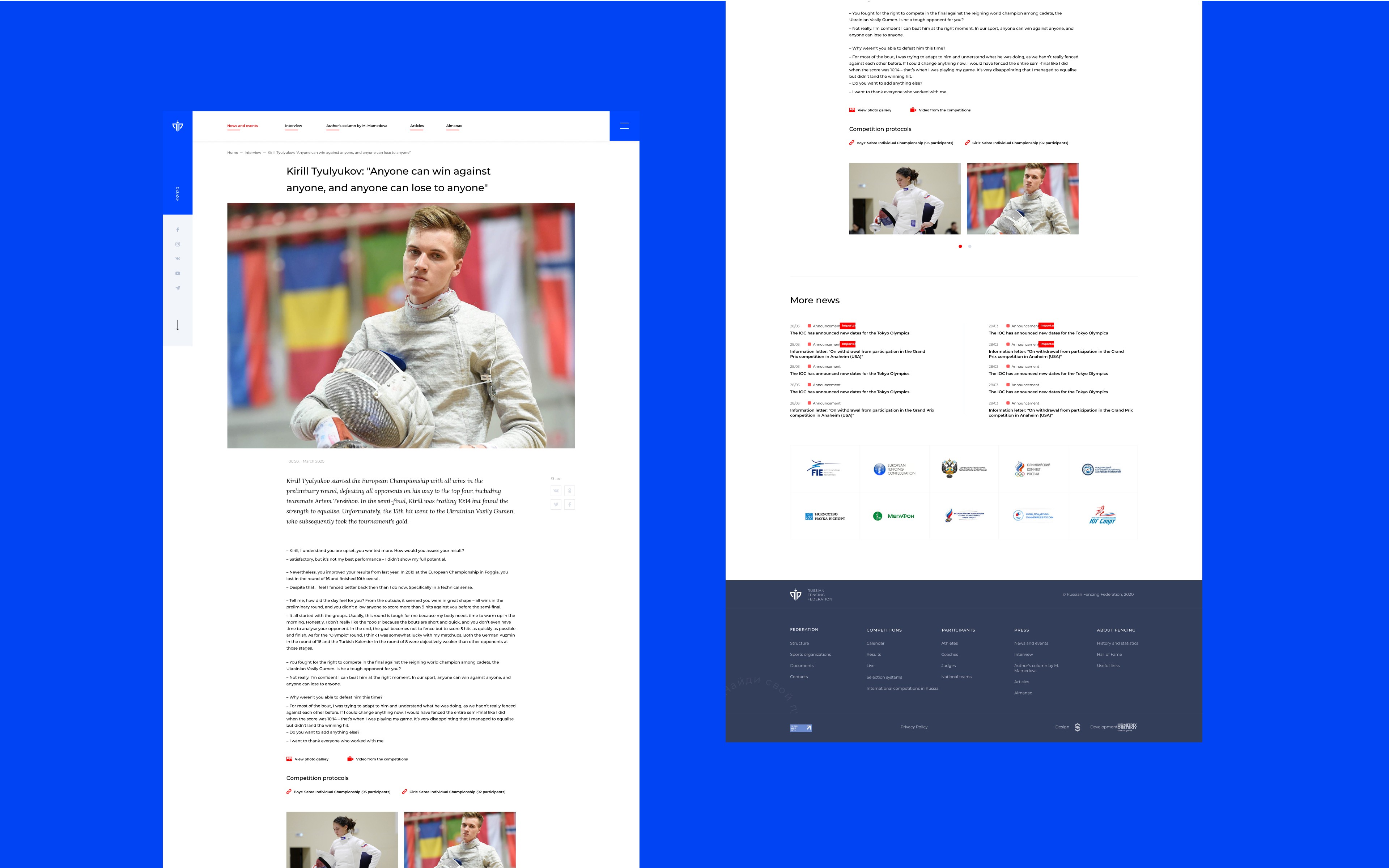
We created a bold, structured interface that blends heritage with modern clarity and elevates the user experience across all screen sizes.
The visual concept was developed to reflect the prestige and athletic elegance of the Russian Fencing Federation. We combined a classic visual tone with a contemporary layout, highlighting the strength and precision of the sport. The design leverages strong typography, clean spacing, and bold accents to create a sense of confidence and structure.
We used a modular grid to accommodate diverse types of content — from news and events to rankings and athlete profiles — while ensuring visual consistency across desktop and mobile formats. The accent blue and minimalist layout help FFR stand out among other sports federation websites, making it both recognizable and timeless.
The interface is fully responsive and built to scale, with a flexible layout system and a clear visual hierarchy that supports quick scanning and easy access to key information.


More Works
GBSV®
©2024


2023
Fencing Federation of Russia
The FFR website is currently recognized as one of the best among sports organization websites in Russia. Therefore, it must reflect this status not only in substance, but also in aesthetics.
Website
Sports
About
A Two-Stage Redesign Unifying Press and Sports Data While Elevating the Federation’s Digital Identity and Visual Impact
The Fencing Federation of Russia is one of the country’s most accomplished sports organizations. This case represents a strategic redesign carried out in two phases. The first stage focused on merging the platform’s dual purpose: unifying the press service’s editorial content (news, events, updates) with the official reporting system containing competition data and rankings. The second stage aimed to create a distinct and modern design language that balanced visual freshness with a timeless aesthetic — highlighting the prestige and legacy of the sport while making the site more engaging and accessible for a broad audience.
Problem
By rethinking structure and design, we helped a leading sports federation unify its digital presence and elevate its online identity.
The Fencing Federation of Russia is one of the nation’s most successful sports organizations — yet their digital presence didn’t reflect this legacy. For years, the platform was split into two disjointed areas: a press-driven news section and a technical competition database. This fragmentation created a confusing experience for users and diluted the brand’s impact.
On top of that, the visual design lacked cohesion, modernity, and emotional resonance. It didn’t match the federation’s status or the prestige of the sport. Our challenge was twofold: first, to merge the two platforms into a seamless, user-friendly experience; second, to develop a bold, elegant visual identity that could feel both current and timeless — celebrating tradition while supporting long-term digital growth.
Solution
By combining minimal aesthetics with strategic research, we delivered a bold yet timeless platform for the Russian Fencing Federation.
Our mission was to rethink the Federation’s digital presence and create a unified platform that connects two key areas: media and press coverage, and official competition results. Working in a tight duo, we started with an in-depth market benchmark of leading sports federation websites to identify patterns, gaps, and opportunities. That research shaped our design direction.
We developed a clean, modern visual identity rooted in minimalism — a style that reflects the precision and clarity of the sport itself. This approach allowed us to maintain a strong, recognizable presence while keeping the focus on the core content. The result is a fast, intuitive, and visually confident website that balances editorial depth with functional clarity — and stands out confidently in the crowded space of sports platforms.
Design
We created a bold, structured interface that blends heritage with modern clarity and elevates the user experience across all screen sizes.
The visual concept was developed to reflect the prestige and athletic elegance of the Russian Fencing Federation. We combined a classic visual tone with a contemporary layout, highlighting the strength and precision of the sport. The design leverages strong typography, clean spacing, and bold accents to create a sense of confidence and structure.
We used a modular grid to accommodate diverse types of content — from news and events to rankings and athlete profiles — while ensuring visual consistency across desktop and mobile formats. The accent blue and minimalist layout help FFR stand out among other sports federation websites, making it both recognizable and timeless.
The interface is fully responsive and built to scale, with a flexible layout system and a clear visual hierarchy that supports quick scanning and easy access to key information.
More Works
GBSV®
©2024
2023
Fencing Federation of Russia
The FFR website is currently recognized as one of the best among sports organization websites in Russia. Therefore, it must reflect this status not only in substance, but also in aesthetics.
Website
Sports
About
A Two-Stage Redesign Unifying Press and Sports Data While Elevating the Federation’s Digital Identity and Visual Impact
The Fencing Federation of Russia is one of the country’s most accomplished sports organizations. This case represents a strategic redesign carried out in two phases. The first stage focused on merging the platform’s dual purpose: unifying the press service’s editorial content (news, events, updates) with the official reporting system containing competition data and rankings. The second stage aimed to create a distinct and modern design language that balanced visual freshness with a timeless aesthetic — highlighting the prestige and legacy of the sport while making the site more engaging and accessible for a broad audience.
Problem
By rethinking structure and design, we helped a leading sports federation unify its digital presence and elevate its online identity.
The Fencing Federation of Russia is one of the nation’s most successful sports organizations — yet their digital presence didn’t reflect this legacy. For years, the platform was split into two disjointed areas: a press-driven news section and a technical competition database. This fragmentation created a confusing experience for users and diluted the brand’s impact.
On top of that, the visual design lacked cohesion, modernity, and emotional resonance. It didn’t match the federation’s status or the prestige of the sport. Our challenge was twofold: first, to merge the two platforms into a seamless, user-friendly experience; second, to develop a bold, elegant visual identity that could feel both current and timeless — celebrating tradition while supporting long-term digital growth.
Solution
By combining minimal aesthetics with strategic research, we delivered a bold yet timeless platform for the Russian Fencing Federation.
Our mission was to rethink the Federation’s digital presence and create a unified platform that connects two key areas: media and press coverage, and official competition results. Working in a tight duo, we started with an in-depth market benchmark of leading sports federation websites to identify patterns, gaps, and opportunities. That research shaped our design direction.
We developed a clean, modern visual identity rooted in minimalism — a style that reflects the precision and clarity of the sport itself. This approach allowed us to maintain a strong, recognizable presence while keeping the focus on the core content. The result is a fast, intuitive, and visually confident website that balances editorial depth with functional clarity — and stands out confidently in the crowded space of sports platforms.
Design
We created a bold, structured interface that blends heritage with modern clarity and elevates the user experience across all screen sizes.
The visual concept was developed to reflect the prestige and athletic elegance of the Russian Fencing Federation. We combined a classic visual tone with a contemporary layout, highlighting the strength and precision of the sport. The design leverages strong typography, clean spacing, and bold accents to create a sense of confidence and structure.
We used a modular grid to accommodate diverse types of content — from news and events to rankings and athlete profiles — while ensuring visual consistency across desktop and mobile formats. The accent blue and minimalist layout help FFR stand out among other sports federation websites, making it both recognizable and timeless.
The interface is fully responsive and built to scale, with a flexible layout system and a clear visual hierarchy that supports quick scanning and easy access to key information.
More Works
©2024