
2024
Climbing Federation of Russia
The Federation of Sport Climbing of Russia is the official governing body for sport climbing within the Russian Federation. It is responsible for developing and promoting the sport, organizing national competitions, and overseeing the training of athletes and coaches.
Website
Sports
About
A Bold Redesign for the Climbing Federation of Russia: Rebalancing Style and Substance While Expanding the Platform’s Mission
The Climbing Federation of Russia already had a functional website and a strong national presence. However, the visual direction no longer aligned with the federation’s evolving goals. The previous design leaned heavily into dynamic, early-2000s stylistics — angled shapes, slanted typography, and aggressively energetic layouts. While athletic in tone, it lacked visual balance and long-term coherence.
We were invited to rethink the federation’s digital presence, stripping away trend-driven aesthetics in favor of a more classical, enduring visual identity. In addition to the visual overhaul, the project scope expanded to include several new sections, most notably a comprehensive long-read chronicling the federation’s history and the rise of climbing in Russia — turning the website into both a news and archival platform.

Problem
Outdated Visual Trends and Lack of Structural Depth Undermined the Federation’s Legacy
The existing website tried to reflect the energy of the sport through flashy design, but this came at the expense of clarity, hierarchy, and sustainability. Skewed typography and slanted components communicated action, but overwhelmed the content and confused users. The identity lacked a stable core — it didn’t express the maturity of a national-level institution.
At the same time, the platform was missing essential content areas and narrative depth. There was no clear way to trace the federation’s impact or the broader history of the sport. For a federation deeply embedded in national athletic life, this was a missed opportunity.
Our challenge was to find a more grounded design language — one that could capture the ambition, discipline, and dual nature of climbing: its tension between inner balance and external struggle.


Solution
A Calm Yet Confident System Rooted in Clarity, History, and the Essence of the Sport
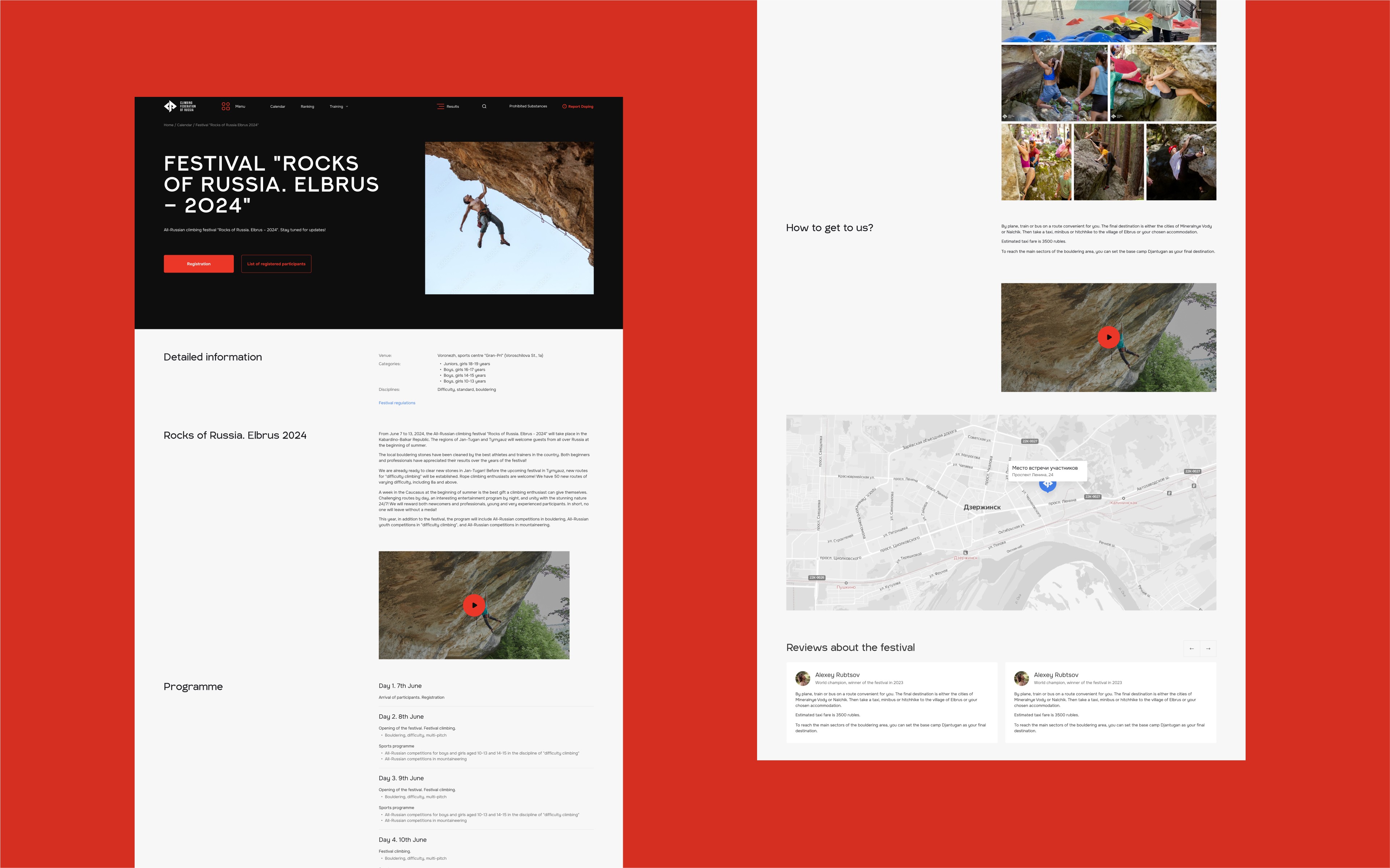
Together with the design team, we reimagined what a sports federation site could be. The new approach leaned into a minimalist framework that emphasized legibility, narrative clarity, and editorial hierarchy. We removed decorative gimmicks and focused on timeless forms — strong typography, rational grid structure, and balanced spacing.
Red became the core accent — not as a flashy gesture, but as a symbol of energy, resolve, and progress. This chromatic choice brought emotional weight and national character, while anchoring the user experience with visual consistency.
Beyond the aesthetic, we also introduced several new content formats, including a large historical section that tells the story of climbing in Russia through visuals and editorial content. This required editorial collaboration, visual design, and modular content architecture.
Design
Despite Timeline Shifts, We Delivered More Than Planned — A Scalable System with Over 150 Screens
Due to underestimated implementation timelines and technical bottlenecks on the development side, the project timeline shifted. But rather than compromise, we scaled up: designing over 150 screens, including auxiliary services accessed from the main site.
The interface was built as a flexible design system — scalable, responsive, and structured around modules that can grow with the federation’s needs. We prioritized adaptive layouts, fluid content components, and clear navigation across devices.
The result is a visual and structural framework that reflects the psychological essence of climbing: an inner stillness paired with relentless motion. It communicates ambition without noise, discipline without rigidity, and heritage without nostalgia — a digital space where climbers, fans, and newcomers all find their footing.


More Works
GBSV®
©2024


2024
Climbing Federation of Russia
The Federation of Sport Climbing of Russia is the official governing body for sport climbing within the Russian Federation. It is responsible for developing and promoting the sport, organizing national competitions, and overseeing the training of athletes and coaches.
Website
Sports
About
A Bold Redesign for the Climbing Federation of Russia: Rebalancing Style and Substance While Expanding the Platform’s Mission
The Climbing Federation of Russia already had a functional website and a strong national presence. However, the visual direction no longer aligned with the federation’s evolving goals. The previous design leaned heavily into dynamic, early-2000s stylistics — angled shapes, slanted typography, and aggressively energetic layouts. While athletic in tone, it lacked visual balance and long-term coherence.
We were invited to rethink the federation’s digital presence, stripping away trend-driven aesthetics in favor of a more classical, enduring visual identity. In addition to the visual overhaul, the project scope expanded to include several new sections, most notably a comprehensive long-read chronicling the federation’s history and the rise of climbing in Russia — turning the website into both a news and archival platform.
Problem
Outdated Visual Trends and Lack of Structural Depth Undermined the Federation’s Legacy
The existing website tried to reflect the energy of the sport through flashy design, but this came at the expense of clarity, hierarchy, and sustainability. Skewed typography and slanted components communicated action, but overwhelmed the content and confused users. The identity lacked a stable core — it didn’t express the maturity of a national-level institution.
At the same time, the platform was missing essential content areas and narrative depth. There was no clear way to trace the federation’s impact or the broader history of the sport. For a federation deeply embedded in national athletic life, this was a missed opportunity.
Our challenge was to find a more grounded design language — one that could capture the ambition, discipline, and dual nature of climbing: its tension between inner balance and external struggle.
Solution
A Calm Yet Confident System Rooted in Clarity, History, and the Essence of the Sport
Together with the design team, we reimagined what a sports federation site could be. The new approach leaned into a minimalist framework that emphasized legibility, narrative clarity, and editorial hierarchy. We removed decorative gimmicks and focused on timeless forms — strong typography, rational grid structure, and balanced spacing.
Red became the core accent — not as a flashy gesture, but as a symbol of energy, resolve, and progress. This chromatic choice brought emotional weight and national character, while anchoring the user experience with visual consistency.
Beyond the aesthetic, we also introduced several new content formats, including a large historical section that tells the story of climbing in Russia through visuals and editorial content. This required editorial collaboration, visual design, and modular content architecture.
Design
Despite Timeline Shifts, We Delivered More Than Planned — A Scalable System with Over 150 Screens
Due to underestimated implementation timelines and technical bottlenecks on the development side, the project timeline shifted. But rather than compromise, we scaled up: designing over 150 screens, including auxiliary services accessed from the main site.
The interface was built as a flexible design system — scalable, responsive, and structured around modules that can grow with the federation’s needs. We prioritized adaptive layouts, fluid content components, and clear navigation across devices.
The result is a visual and structural framework that reflects the psychological essence of climbing: an inner stillness paired with relentless motion. It communicates ambition without noise, discipline without rigidity, and heritage without nostalgia — a digital space where climbers, fans, and newcomers all find their footing.
More Works
GBSV®
©2024
2024
Climbing Federation of Russia
The Federation of Sport Climbing of Russia is the official governing body for sport climbing within the Russian Federation. It is responsible for developing and promoting the sport, organizing national competitions, and overseeing the training of athletes and coaches.
Website
Sports
About
A Bold Redesign for the Climbing Federation of Russia: Rebalancing Style and Substance While Expanding the Platform’s Mission
The Climbing Federation of Russia already had a functional website and a strong national presence. However, the visual direction no longer aligned with the federation’s evolving goals. The previous design leaned heavily into dynamic, early-2000s stylistics — angled shapes, slanted typography, and aggressively energetic layouts. While athletic in tone, it lacked visual balance and long-term coherence.
We were invited to rethink the federation’s digital presence, stripping away trend-driven aesthetics in favor of a more classical, enduring visual identity. In addition to the visual overhaul, the project scope expanded to include several new sections, most notably a comprehensive long-read chronicling the federation’s history and the rise of climbing in Russia — turning the website into both a news and archival platform.
Problem
Outdated Visual Trends and Lack of Structural Depth Undermined the Federation’s Legacy
The existing website tried to reflect the energy of the sport through flashy design, but this came at the expense of clarity, hierarchy, and sustainability. Skewed typography and slanted components communicated action, but overwhelmed the content and confused users. The identity lacked a stable core — it didn’t express the maturity of a national-level institution.
At the same time, the platform was missing essential content areas and narrative depth. There was no clear way to trace the federation’s impact or the broader history of the sport. For a federation deeply embedded in national athletic life, this was a missed opportunity.
Our challenge was to find a more grounded design language — one that could capture the ambition, discipline, and dual nature of climbing: its tension between inner balance and external struggle.
Solution
A Calm Yet Confident System Rooted in Clarity, History, and the Essence of the Sport
Together with the design team, we reimagined what a sports federation site could be. The new approach leaned into a minimalist framework that emphasized legibility, narrative clarity, and editorial hierarchy. We removed decorative gimmicks and focused on timeless forms — strong typography, rational grid structure, and balanced spacing.
Red became the core accent — not as a flashy gesture, but as a symbol of energy, resolve, and progress. This chromatic choice brought emotional weight and national character, while anchoring the user experience with visual consistency.
Beyond the aesthetic, we also introduced several new content formats, including a large historical section that tells the story of climbing in Russia through visuals and editorial content. This required editorial collaboration, visual design, and modular content architecture.
Design
Despite Timeline Shifts, We Delivered More Than Planned — A Scalable System with Over 150 Screens
Due to underestimated implementation timelines and technical bottlenecks on the development side, the project timeline shifted. But rather than compromise, we scaled up: designing over 150 screens, including auxiliary services accessed from the main site.
The interface was built as a flexible design system — scalable, responsive, and structured around modules that can grow with the federation’s needs. We prioritized adaptive layouts, fluid content components, and clear navigation across devices.
The result is a visual and structural framework that reflects the psychological essence of climbing: an inner stillness paired with relentless motion. It communicates ambition without noise, discipline without rigidity, and heritage without nostalgia — a digital space where climbers, fans, and newcomers all find their footing.
More Works
©2024